
Today we are going to take a look at the two brand new covers in Jill Shalvis’ Animal Magnetism series and do a little side-by-side comparison. I love Jill Shalvis’ books; they are all sexy and fabulous. Her covers are also flirty and fun and have gotten a makeover. Let’s take a look at these, side-by-side and talk about what we love.
The first book in the series is Animal Magnetism. The original cover is the one on the left, and the new one is on the right.
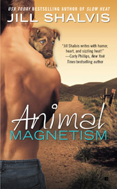

MinnChica: While I love the original cover, I do like the new one as well. We’ve come to know Shalvis as having covers featuring a (usually) headless couple in some kind of embrace. I like that Penguin has followed in Grand Central’s footsteps for branding Shalvis this way, and I think the tone of the cover is overall more flirty and fun. I have to admit though, the old cover looks a little bit more polished.
MiscJoy: Being an animal lover myself it is easy to be drawn to Shalvis’ slice-of-life books. I think the new covers give a better indication of what the story is about and put a focus on the romantic elements while still including the animals into the theme. I like the sepia-tones of the original covers (and hello, sweet puppy-dog eyes!), but I think the color pallette being used in the new covers lends a fresh look that seems more reflective of the content.
E: Her original cover seemed to focus on the hero’s characteristics which are very enjoyable. I also completely agree that the change of color palette, the positioning of the couple, and the dogs that look like they are doing well not in need of help or comfort brings out the humor that is usually present in her stories.
Has: I totally agree about the changing of the colour pallette and tone which is much more vibrant and it stands out more. I also like the inclusion of the couple with the dogs, which reflects more of the humour as well as the romantic tone of the book. I also love that the new covers have kept the same stylistic theme but changed it up a bit.
The second book in the series is Animal Attraction. Again, the original image is on the left. 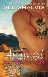
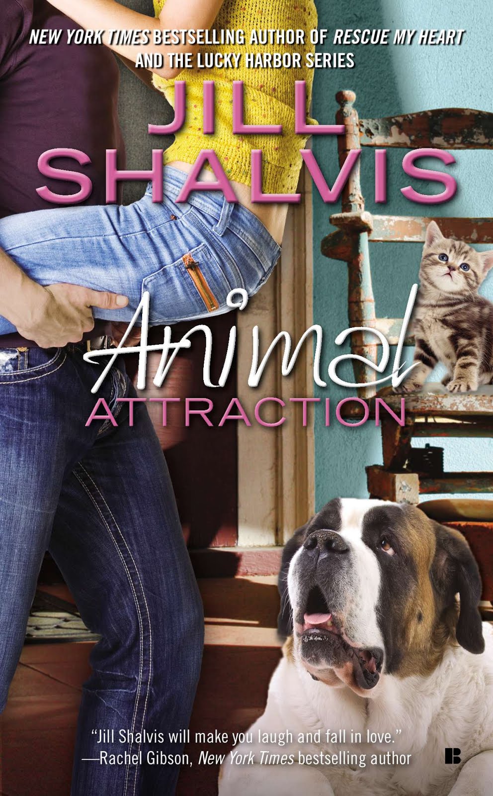
MinnChica: I love the kitten in the old cover, she looks so sweet and playful. However, I think I like the new cover better. Again, the fun and flirty feel of the cover with the couple says so much more about the tone of the overall book. I loved Jade and Dell in this story, and I think the couple is a fairly great representation of the two of them. Plus, I love that Penguin added in the big dog on this cover. I think it speaks more to Dell and Jade’s overall story.
MiscJoy: I so agree. I think the new covers do a great job at representing the whole story. With the original cover, we don’t get an immediate sense of the romance. We can infer it from the hunky guy on the cover, but as much as I think the kitten is adorable, it doesn’t really give me a sense as to how it fits with the hunky guy. If I were unfamiliar with the series, it would leave me wondering why the hunky guy was holding the kitten as I wouldn’t understand the full context just from the cover alone. The new cover clearly says “this is a romance novel” and now the book title gives me better insight into the inclusion of the animals into the overall theme – it just fits better.
E: Awww the kitty is sooo cute and again speaks towards the hero. I have a soft spot for muscular guys holding cuddly little things but I like the roundedness that is evident in the new cover. We still have the cuddly kitten but the focus is on the couple and how the animals are part of that circle. The bright colors and body positioning again speak towards liveliness and humor.
Has: Another ditto on the new cover being more lively and vivid. I also think the cosy feel of the background in the home again is more reflective of the tone of the book, with the cute kitty and dog along with the couple. I found the original cover a bit muted even with the cute kitten and hero but it doesn’t really stand out as much compared to the new one which illustrates the tone of the book much more.
The third book kept the same cover, and it’s personally my favorite in the series overall:

Penguin has now released the cover for the fourth book, Rumor Has It, set to be released November 5th.

I think this is a great cover as well, and the dogs are super cute in the background as well.
Here is the blurb for the new release:
Special Ops soldier Griffin Reid doesn’t exactly have happy memories of growing up in Sunshine, Idaho. He’s only come back to recover from a war injury, and while he refuses to admit he’s in a weakened state, he finds comfort in the last person he’d expect.
Kate Evans teaches fourth grade science in Sunshine, the place she’s always called home. Dreaming of graduate school and a happily-ever-after, she’s desperate to break out of the monotony of Sunshine. Luckily, a certain sexy man has just come back into her life.
To Griffin, Kate as always been his little sister’s friend, but now he’s finding her to be so much more. As both attempt to forge their paths, they must decide if their passionate connection can turn into something lasting…
So what do you think of the new covers? Love ‘um? Hate ‘um? Happy with the change?
Well, the new covers are nice, but just a dime a dozen. I would totally go for the hunky guy with the pet.
I like both covers although I never found anything wrong with the originals. And while I do like the more upbeat newer covers, part of me sees a little bit too much photoshopping problems between the foreground and background (aside from Rescue My Heart which looks perfect). Usually I’m totally down with books getting new covers but I loved the originals so I’m sort of meh about them.
I agree with Ada H about the photoshopping problems with the first two . . and not keen on lots of cutsie animals being placed in any available leftover space . . so actually prefer the original covers. Like the third and the fourth though – the couple don’t look as awkward position wise 😀
I did not like the original cover and almost did not read Animal Magnetism as a result. I greatly prefer the new covers.
@xaurianx – There is definitely something to be said for a sexy man with a small animal. RAWR
@Ada H. – Yeah, the photo shopping of the new covers isn’t as good as books 3 and 4, but what can you do?
@Willa – I love the 3rd and 4th covers. They are some of my favorite Shalvis covers of ALL her books.
@Beth R – I’m glad you still picked them up, I imagine you loved the books despite the old covers?
Pingback: Fangirl moment over covers | Zoe York